When you’ve got a really good insight from your People Powered Data, you’re going to want to show it off. A gorgeous chart can make a great piece of marketing material, a powerful addition to a presentation, or an attention-grabbing piece of visual information. When you’ve chosen the type of graph that you want to use, the next step is to think about color.
SurveyMonkey’s color customization features will help you make your charts more polished, illustrative, and personalized for your business. You can use data visualization as proof points in bigger pieces of content (reports, presentations), or as marketing collateral on their own. Images resonate with audiences more than other types of content—for instance, an infographic is 30 times more likely to be read than an article. Charts and graphs help you tap that visual tendency.
The right colors can help you catch reader attention and make a stronger argument. Our customization features let you promote your brand in-survey, create riveting content you can use as marketing collateral, and represent your data visually so that you can make the point you want, instantly and powerfully.
Tell your story with color
You can customize your chart colors to reflect your survey topic, to match your brand color, or to generally get the aesthetic that you want for your data. You can also use them to emphasize some of your findings and start crafting a narrative.
Do you want to call attention to one specific piece of response data? Highlight the most important section with a bright color and use subdued colors (or shades of gray) to keep the reader focused. Want to convey a range of values (like positive to negative or liberal to conservative)? Use colors that shift either from lighter to darker or warmer to cooler.
Here are a few more good rules of thumb to help you choose the right colors:
- Pick the colors that most closely match your meaning. In general, if you’re using different shades of the same color, people tend to associate lighter colors with low values and darker colors with higher values. That’s the way most mainstream charts are designed, and following suit will make your point clearer.
If the topics you’re covering happen to align with a color already, make sure to reflect that in your graph. Bars that represent Democrats and Republicans should be blue and red. If you’re comparing the Giants and the Yankees, use orange and blue. Your readers will have already built certain associations, and being able to tap into those can make your charts more powerful.
- Customize colors to reflect your brand. Whether you’re dropping this graph into a customer feedback survey, a public report, a presentation for your boss, or an article, you want to show ownership over the information. This is especially important for customer-facing materials, or public content that you want associated with your organization.
SurveyMonkey provides a diverse color palette, specifically selected to optimize for data visualization. Our paid accounts let you change your chart colors, and we’ve recently expanded the selection to include a flood of new colors. You can also now enter a hex code, which uses HTML to generate the exact pitch-perfect color for your brand.
- Make colors distinct and easy to see. When you’re choosing different colors to represent your survey responses, make sure not to double dip or it will get confusing—with one exception: If you want to highlight one finding, you can make every other variable the same color so that the one you care about really stands out.
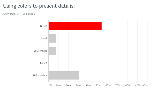
Avoid bright neons and yellows, which are harder to look at and difficult to read, if you have any text. And if you’re making a pie chart, make sure that the colors that you use in conjoining sections are distinct from one another.
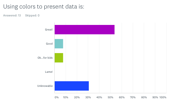
One area that chart makers commonly overlook? Color blindness. There are dozens of different types of color blindness, and if your chart uses colors that big portions of the population can’t distinguish between, you could end up losing their attention. Use this online tool to see how different color combinations stack up.
- Be appealing, not overwhelming. If you have too many colors in your chart or graph, you could end up distracting the reader from the narrative that you’re trying to create. The most powerful images make significance clear, which means that you don’t want the reader to have to do too much comparing. Colors that are too glaringly bright can be off-putting, too.
If you really want to get in the weeds about color theory (for example, if you plan to use these charts in advertisements or promotional materials), there is a ton of research that you can check out about the psychology of different colors. Here’s some from the University of Winnipeg, Cardiff Business School, and the Journal of Marketing Science.
Personalize chart and graph color in SurveyMonkey
You can customize your chart colors In the Analyze Results section of your survey. Click on Customize > Colors.
You can also open the chart customization interface by clicking directly on a colored bar or pie slice in your chart and selecting a customization option from the menu that will appear. You’ll notice that your changes are instantly reflected in your chart. That way, you can preview changes and decide whether or not to save them as you make them.
You can see that the color tiles that match your answer choices. Feel free to drag and drop them to reorder the colors, as needed.
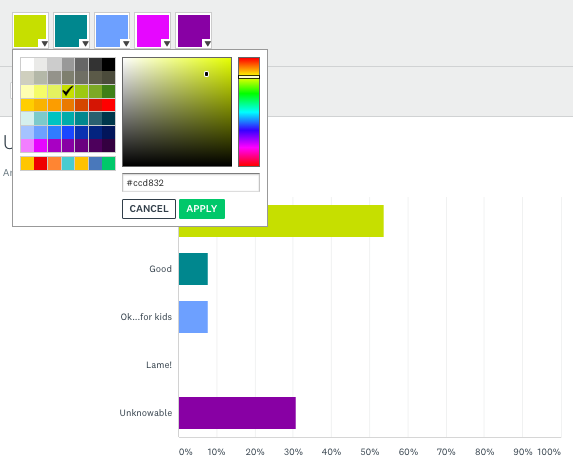
Next, click on the down arrow on the color tile to expand the color palette and choose from a wide selection of color choices. This is also where you can enter a hex code to get the exact color you want.
When you’re done choosing, you can hit “Apply to all”, if you want to, which will change all the colors and chart types (pie, bar, graph, etc.) to be consistent throughout the survey.
If you want a specific color palette, you can now preview the results for free. If you have a basic account, you can choose colors and preview changes to see what your chart would look like with custom colors. If you like what you see, you can upgrade to a paid plan to save the changes.
For more detailed information about how to customize charts and colors, check out our step-by-step guidance in the help center, which will take you through every click.
Want to get more from features?
SurveyMonkey's powerful features help you ask, understand, and do more with your survey data.